
Understanding the Pedagogy ( Teaching Method)
What we learned:
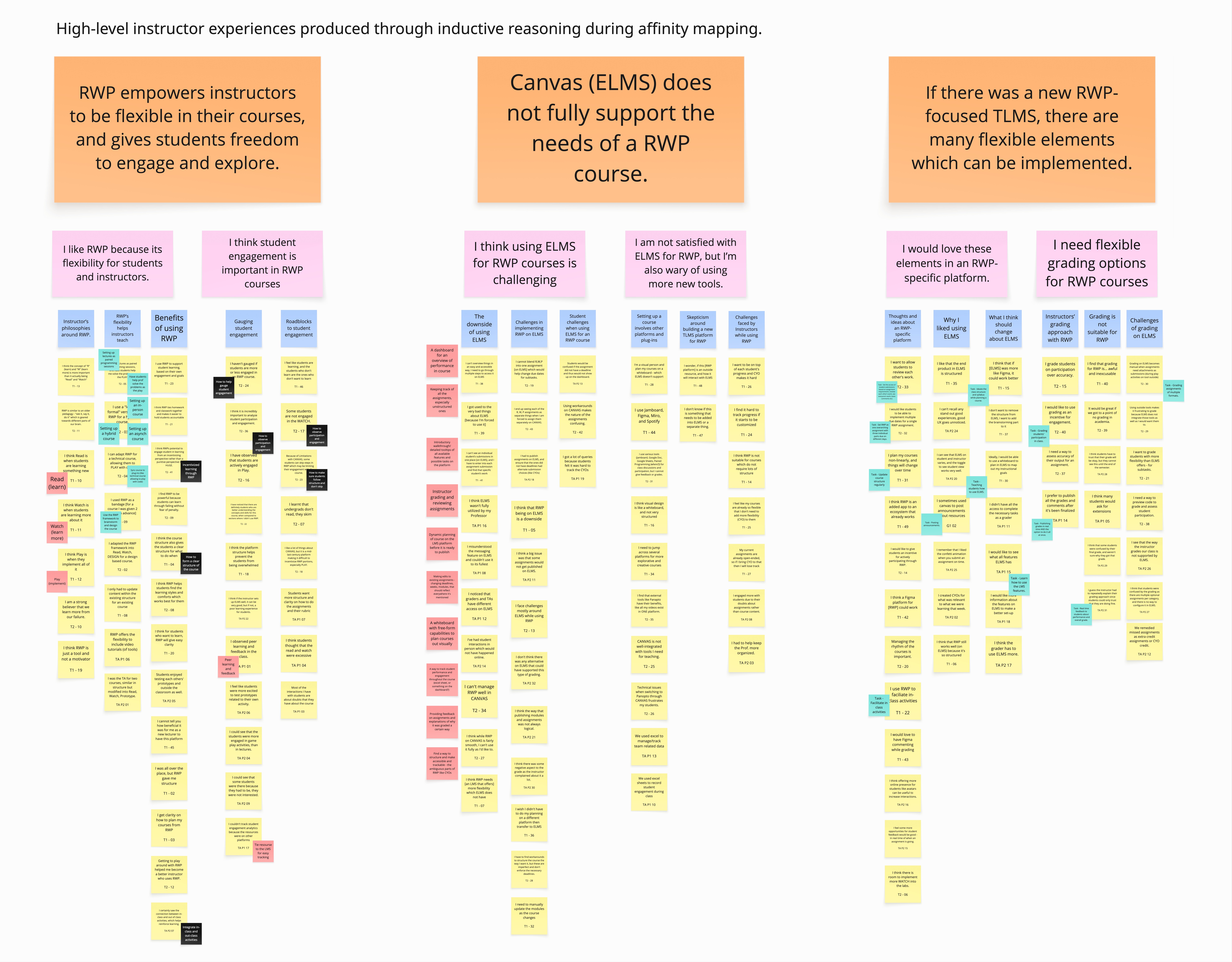
RWP (Read · Watch · Play) supports flexible, student-driven learning focused on experimentation, community, and personal learning paths.
How we learned it:
Literature review + project proposal docs from the client.
.jpg)
.gif)